From structure to experience
Applying the RBL Framework and mapping UI elements to the Semantic Role Matrix is one step in a larger design process. Two steps follow: interaction design and spatial layout.
Interaction design
Once UI elements are mapped into the Semantic Role Matrix, their semantic role, priority, and spatial anchoring are visible at a glance across the whole system. This makes interaction design more straightforward.
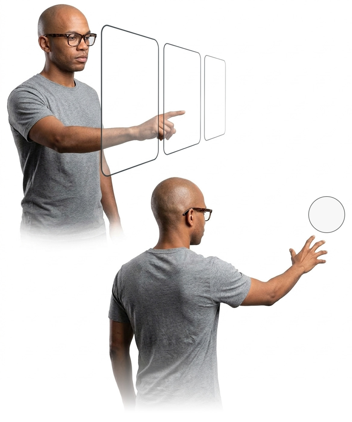
Interactions can be either direct or indirect. Direct interaction involves manipulating an element within reach, such as touching it with a hand or controller. Indirect interaction involves acting on an element from a distance, such as pointing at it with a controller ray or gaze, and using controller buttons, gestures, or voice to act on it. Both types of interaction have a place in spatial UI, and the choice affects both comfort and usability.
Users can move through the environment, approaching or moving away from world-anchored or entity-anchored UI. An element that is within comfortable reach at one moment may be too far away at another. For this reason, and to accommodate different user preferences and abilities, both direct and indirect interaction should be supported where possible.
Spatial layout
Once a UI element's role in the user interface is known, the next question is where it should sit in the user's field of view, and how depth can help communicate hierarchy and priority.
This section focuses specifically on user-anchored UI, since its placement is fully within the design and development team's control, unlike world-anchored or entity-anchored UI, which is placed relative to real-world entities or objects the app doesn't govern. This is where Calm Technology* principles become especially relevant: attention is limited, and layout should protect that rather than compete for it.
*Calm Technology
A design approach that aims to reduce unnecessary demands on attention, keeping non-essential information in the periphery and allowing it to move into focus when needed.

Placement order
The suggested order is to design high-consequence UI first, then low-consequence UI, and finally medium-consequence UI. This prioritises visibility and access for the elements that matter most.
Consequence level is not always fixed. An element's consequence can shift, for example between system states, becoming more or less important depending on what else is happening. When this is the case, placement is not a one-time decision: the element's position and prominence may need to adapt alongside its changing consequence level, rather than being set once and left as is.
Low-consequence UI should use the periphery of attention when possible, in line with Calm Technology's emphasis on keeping non-essential information at the edge of awareness rather than the centre of it. Low-consequence UI may not need a visual component at all, and can instead communicate through audio or haptics. This reduces visual complexity and gives more prominence to higher-consequence UI.
Medium-consequence UI is placed last to fit comfortably between high and low-consequence UI. Its prominence should match its priority, protecting the user's cognitive comfort.
Field of view and head movement
Content should be placed so it stays visible without requiring frequent head movement, since repeated head turns and tilts can cause physical strain over time. The central field of view should be reserved for high-consequence UI in a way that leaves the user's view of the environment unobstructed, so real-world hazards remain visible.
Depth
Depth layering communicates hierarchy: elements closer to the user can read as more important. Depth should be used with restraint, since constantly refocusing the eyes between near and far content, as well as the real environment, can be tiring. UI placed too close to the user can also be uncomfortable and difficult to focus on. Comfortable viewing distance depends on the device, context, and user, so depth should support hierarchy rather than become a constant source of visual separation.
Anchoring across contexts
Users may alternate between sitting and moving, or may have limited mobility and be unable to move toward world-anchored UI or use every interaction modality. In these cases, designing UI elements to transition between user-anchored and world-anchored states, and supporting multiple interaction modalities, can improve comfort, usability, and accessibility.
This can be implemented as an automatic, adaptive behaviour, or as a setting the user controls.
Safety
While the framework promotes safe UI placement, physical safety ultimately depends on actual design decisions, platform capabilities, and context of use. As a general rule, UI should never distract from or obstruct the user's path while moving through the physical environment.